We Watched the New Lindsay Lohan Movie So You Don't Have To (But, Maybe Do It Anyway?)
And we crown awards season's ugliest step-and-repeat, AND MORE.
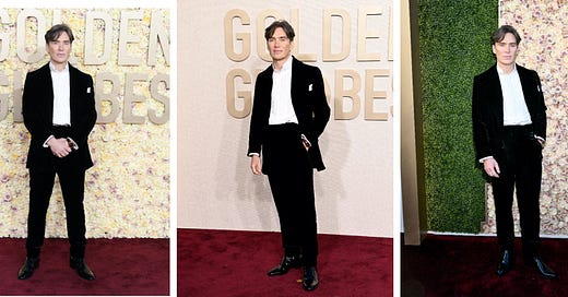
Awards season has finally come to a close — until the CMTs in April, anyway — thus the time has come to take a comprehensive look back at the most important and artistically vital aspect of the entire dog-and-pony show: the red carpets. No, literally the carpets. The set-up of awards show step-and-repeats has become needlessly complicated over the last few years, as everyone keeps trying to reinvent the wheel, or as the case may be, redesign it. Sometimes, this reinvention is welcome — say, for example, the time Anna Wintour decided the Tonys red carpet was too ugly and forced them to add that Vogue-endorsed backdrop that just looks like a hedge. Other times, you end up with a dude protesting outside the Kodak because the Oscars’ champagne-colored carpet is so ugly. So, let’s see which major show’s props were up to snuff, and which were just ugly. As a note on methodology, as a way to focus on the backdrop and carpet and not the celebrity, I’ve chosen Cillian Murphy as the photographe…


